
Button
Click a button to perform an action. The button component provides a quick way for users to interact with data. When clicked, buttons perform functions like calling APIs, updating data or inserting new data.
Ways to use a button
Add in-line actions
You can add an in-line button (child component) to a table, detail view, or card list (parent component). The button is automatically displayed for every record in the parent component.

Get inputs from multiple components
You can configure buttons to take inputs from a single component or multiple components.
Set specific values on click
Buttons can be configured to always set a certain value.
If you want to allow users to verify the inputs before submitting or input their own values, use a form component instead.
Bind its results to another component
The results of the function performed by the button can be displayed in another component, like a table or detail view. Within the other component's configuration, select "Binding" and then choose this button component.
Configuring your button
Data
Source
First, select the function that this button should trigger when a user clicks on it.

For most databases, you'll see auto-generated insert, update, and delete functions. For example, if you selected your PostgreSQL database with a Users table, you'll see "insert Users record", "update Users record", and "delete Users record" functions appear automatically.
For most business apps, auto-generated functions will appear, based on the available APIs of that app. For an app like Stripe, you'll see functions for "insert Balance Transactions record", "update Balance Transactions record", "delete Balance Transactions record", and so forth for the resources available in Stripe's API.
If you created any custom functions for a database or HTTP service, those will also be available for you to choose from.

Text
You can give your button a name (used to reference this component within Internal). Then, you can select an icon for your button (optional) and enter in the text to be displayed on the button.
Fields
Here you'll specify the actual inputs that are passed along when the button is clicked. To do this, you’ll select fields, and then specify what values go in them.
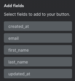
Select fields
By default, only required fields are added. For example, If you’re updating a record in a database, this would just be the primary key. Click “+” to view a list of all available fields for your selected function.
Specify values
You’ll need to choose a value that is passed in for each field. Click the field to bring up options. You can get this value from an existing component, set a custom default value, set a UUID, set to null, or set to the date-time the button is clicked (date/time fields only).
In the example below, we’ve chosen to set the value of the “id” field with the “id” of the selected row of the Users table (which is a table component in this Space).

In this next example, we’ve chosen to always set the status field’s value to “Active”.

Check out Field Configuration to learn more.
Visibility Rules
You can create visibility rules that will determine when this component is visible and able to be interacted with.
Effects
Display Message
This effect allows you to define the text of messages for success and failure of submission of the data from the component.
- On Successful Submit - Message to be displayed in a green-colored JavaScript alert message that will show in the UI on successful completion of the transaction between Internal and the target data source.
- On Failed Submit - Message to be displayed in a red-colored JavaScript alert message that will show when the transaction fails.
It's also important to note that not including a message will fall back to the "system message" for that component. In the case of a success, this usually produces a JavaScript alert that says "Success" and not much else. In the case of failure, this can be a custom error message added to the meta data transformer in the function editor.
Additionally, only one message is allowed to be configured per function success and one for failure.
Refresh Component
Usually, if your import changes some data that is displayed in the Space, you'll want to refresh the data. On Submit: Refresh Component options allow you to refresh the data of any component in the Space. Simply select the component to refresh from the dropdown. When the submission from your button is successfully complete, the selected component will refresh and display any changes to its data.
Auto Update by Key
This is the default state for "Effects" for this component. When the component submits its data successfully, components that are bound to that function will automatically be updated by key (e.g. Sending an email-address update to a user's table should result in the updating of associated row table data associated with that key.)
Design
Here you can see design attributes and set how overflow content is displayed.
Left and Top options only appear for top-level components (components that are placed directly onto the Space canvas).
Left: Set the distance of this component from the left edge of the Space canvas (x-axis position). This can be expressed as a % of the canvas or as a number of pixels.
Top: Set the distance of this component from the top edge of the Space canvas (y-axis position). This can be expressed as a % of the canvas or as a number of pixels.
Width: Set the width of this component as a number of pixels or as a % of the containing unit.
Height: Set the height of this component as a number of pixels or as a % of the containing unit.
If the component is a top-level component, the containing unit is the Space canvas.
If the component is in-line within another component, the containing unit is the parent component.
If the component is within a flexbox component, the containing unit is the flexbox.
Type: You can change the type and shape of your button using the configuration dropdown in the bottom right of the menu:

Of the types, Link is unique -- It can be configured just as normal text elements are in your Spaces:

Snap to Grid: Set the edges of this component to snap to the grid canvas in the Space.
Once you’re done configuring your component, you can save and publish your Space so it can be used.