
Field Configuration
Field configuration lets you specify how the values for your fields are determined. For example, you can set up a form field called "Status" to be a dropdown list with "Standard" and "VIP" as options. Or, you can have have the "user_id" parameter for your HTTP function populated from the "id" column when a user selects a row in your Users table.
Field configuration plays an important role in determining how your tool will function, and understanding all the options below will help you build better, easier-to-use tools. When you're configuring a component, click on a field to bring up configuration options:
Value
Specify where the value for each field should come from. Values must be valid for the field type (integer, string, etc). The options below may vary depending on the field type or component.
-
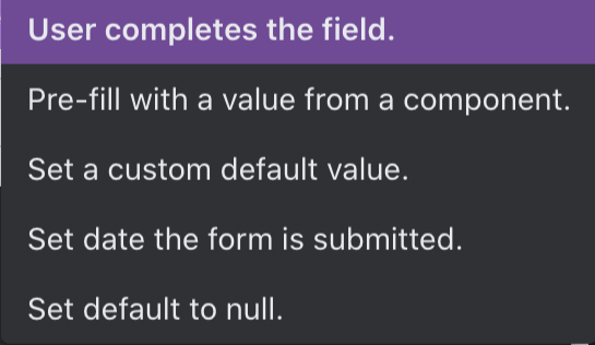
User completes the field: (Form and Pop-up Form Components only)
Choose a component type for this field (the user will use this to input the value); see each page for config details:-
Input
-
Text Area
-
Dropdown
-
Radio Button
-
Tag Selector
With these component options, the user can enter in text or choose from a selection. Note that default values can also be set to a specific value, pre-filled with a value from another component, set to null, or set to a template (which can use a combination of text & variables in the Space).
-
-
Set a custom default value (Button component): Use this option when you have a specific (non-variable) value to set this field to.
Tip:
This option is often used for quick settings changes with a button. For example, you can configure a “Promote” button within a Users table. This button is configured to set that user’s “Status” field to “vip”.
- Use / pre-fill a value from a component: Use this option when the data you want exists in another component in the Space. Connecting components together ("binding") lets you create more powerful, time-saving tools.
- To get the value from an input, select the name of the input component → value.
- To get the value from a table, select the name of the table component → selected row → data → column name where the data should come from. When using this tool, users must select a row in the specified table to provide the value for this field.
- To get the value from a detail view, select the name of the detail component -> data -> field name where the data should come from. The data used will come from the record shown in the detail view.
- To get the value from a card list, select the name of the card list component -> data -> field name where the data should come from. The data used will come from active record in the card list.
- You can also use Current User data for this value.
- You can also pre-fill using values from a number of other components, like text area, tag selectors, etc.
- Environment lets you bind to the name or slug of this Space.
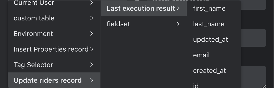
- In addition, you can bind to a value from the last execution result of a function. (This option is only displayed for auto-generated functions in SQL databases) This will allow you to bind to values that are output or returned from these functions.
Examples:
Let’s say you’re creating a form to update data in your Orders table. You can configure your form fields (CustomerID, ProductModel, Quantity, etc) to be pre-filled with the existing values from the Orders table (Orders -> Selected Row -> Data -> Quantity).
When using your tool, a user simply needs to select a row in the Orders table, and then all of that data will be pre-filled in the Update form. Users can quickly change the fields that require editing and submit the rest.
Another common way to use this option is to get the value input from an input component. Let's say you set up an HTTP function that takes a user's email as a parameter. In your tool, you have an existing input component named UserEmail. You could configure a button that would take the value that's in the UserEmail input and pass it as the value for email when calling the HTTP function.
- Set a UUID: Use this if you want Internal to generate and set a new universally unique identifier as the prefilled value for this field.
This option only appears for certain data types. - Set (default) to null:
- A null field is different than a blank field - use this if you're working with an API that requires null values.
- Set date and/or time when form submitted or button clicked: (Only available for date-time fields) Will submit either the date, time, or date-time at the point the user clicks the button or submits the form.
Tip:
Use this option to save time for "Created At", "Modified At" and similar fields. If you do choose to use this option, you'll almost always want to configure this field as a hidden field for a form, or use it with a button. This will ensure that the user doesn’t alter these values.
- If you're setting up a HTTP function parameter and this option is missing, make sure you set the parameter Type to "Date/Time".
Note for forms and pop-up forms:
The pre-filled (default) values you set are still editable by a user before submitting. If you do not wish for a user to see or be able to edit these pre-filled values, use a hidden field.
Example:
You have a field “userID” which you have configured to be set to a generated UUID.
If this field was part of a form or pop-up form, the user would see the generated UUID in the form field and be allowed to edit that pre-filled value (if desired).
If this field was part of the hidden fields in a form, or within a button/dynamic button, the generated UUID (pre-filled value) would be the value set; the user will not be able to view or edit it.
Field Type
You can specify the format in which your field will appear, like paragraph text or dropdown. This option does not appear for buttons or hidden fields in a form, as those components do not allow for manual input.
Blank and null options
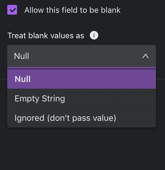
Allow this field to be blank: Null, undefined or empty strings are allowed as an input to this field. This applies whether the user leaves the field blank, the prefilled value from another component is blank, or the default value is left blank.
Treat blank values as: Choose how you want to treat blank values.
- Null: blank values are changed to null values
- Empty string: blank values are left as empty string
- Ignored (don't pass value): blank values are ignored and no value is passed for this field/parameter. If you want to include optional fields in a form, you can use the "Ignore"option for those optional fields/parameters; only filled-in values will be sent to the request.
Notes:
- By default, the blank values will be set to "Ignore" when the input component is added outside of forms
- By default, the blank values will be "Null" for inputs inside of forms
- For Tag Selector components, "Empty String" and "Empty Array" will be available depending on the Convert value to CSV string setting. If converting to string: "Empty String" is available, otherwise "Empty Array" is available
- "Ignore" is disabled for inputs that correspond to required function parameters because those parameters must pass a value
Updated about 1 year ago