
Table
Use tables to view your data. Tables are a key component within many tools, allowing users to search and manipulate its data, while also providing its data as inputs to other bound components, like forms and buttons.
Ways to use a table
Search and filter your table data using the built-in search input
You can search through your table data using the input in the top-right of a table component. Start typing in the field name (column) you want to search, then the operator, then the search term. Internal supports the following operators: =, !=, <, <=, >, >=, contains, in, not in. Note that not all operators will appear, depending the the field type.
Note: For the search bar to appear in your table, your underlying function MUST contain at least one filter. With most data sources, filtering is assigned automatically, but for some (like HTTP), at least one filter must be manually applied. You can read about filtering in this document.
Additional Note: When using the search filter, timestamps in UTC must provide "+00:00" at the end of the timestamp string or the table will not filter (e.g. 09/28/2022 02:40:39 PM+00:00).
Provide data to prefill other components fields
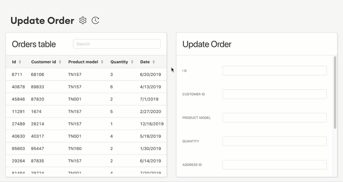
When a user selects a row in a table, the data in that row can be used as inputs for components like buttons, forms, and pop-up forms. This is done through Field Configuration (within the non-table component).
Dynamically filter data shown in other components
When a user selects a row in a table, the data in that row can be used to filter components like card lists, detail views and even other tables. Use the filters for that component and choose to compare against data coming from a selected table row.
Display in-line actions
A number of components can be inserted into a table - these components appear in every row and typically perform functions either using or changing the data in their row. You can add buttons, pop-up forms, dynamic buttons, text, s3 uploaders, links and images.

Display the results from the execution of a function
Tables can also be bound to the results of a component (that is in the Space). This allows you to display the data that is being returned.
Render raw mode or pretty mode
If your data source has JSON that you want to display in Raw Mode or Pretty Mode, you can now switch between the views in a Table by clicking on the ellipses next to the value you'd like to see. You can also copy the JSON to your clipboard.

Configuring your table
Source
First, choose how you'll populate the data in this table. Select "Function" and then the corresponding function you want to use (ie, "list users records"). Select "Binding" and then choose a component in the Space in order to have this table display its results.

Text
Then, give your table a name (used to reference this component within Internal). You can also customize the table title.
Parameters
In some cases, the Function you're using may require a parameter to be specified. For example, you may need to pass in an ID in order to retrieve the data and display it in the table. Click on the parameter to provide a value.

Columns
Here you can add, remove, hide and rearrange table columns. Click on a column name to customize how your data in the table is displayed, using icons, pillboxes, or links. The "autolink" option appears for fields that are primary keys or foreign keys - and will turn this into a link to the Super Record.

You can also click "+" and click Components to insert inline buttons, pop-up forms, text, s3 uploaders, links and images to your table.
Hidden fields
If you don't want a user to see a data column, but still want to use its data in other components, click the eye icon to make it a hidden field.This means the column won’t be displayed in the table, but you can still use the data in the column as inputs for another component.
Sorting
Select the field to sort on, then choose "Ascending" or "Descending". Users can still sort the table, this setting merely determines the default sort order.
Filters
You can set filters to change what's displayed in the table, based on your criteria. If you’re working with a large unfiltered data set, you can use the “require a filter to be set before loading data” checkbox.
Click the “+” to add your first table filter.

Each filter has a table field which is compared to a value. A preset filter compares against a fixed value, whereas a dynamic filter compares against data from another component. Dynamic filters are another way to bind components together to add functionality.
Preset filter example
You have a table of Users which contains users with both "Active" and "Suspended" status. You're creating a tool to reinstate suspended users, so you want to only display "Suspended" status users in your table. You set up the following filter: status [is equal to] suspended .
Other examples of preset filters:
- Battery_level [is less than] 20
- Status [is not equal to] VIP
- Email [contains] "@gmail.com"
- LastName [is not null]
Dynamic filter example
Let's continue the example above of an on-demand service with a Riders and Rides table in the space. You want to make it easy to look up the rides for a given rider - the two tables are linked by a foreign key; the id column in the Riders table matches with the rider id column in the Rides table.
You create a filter in the Rides table and bind it to the Riders table -> Selected Row -> Data -> id:

This would bind these two tables together, so that whenever a user clicks on a rider in the Riders table, the Rides table is filtered down to display just that rider's rides.

Just like binding two tables, dynamic filters can also bind a table with a filter, detail, or card list component:
- Detail: name of detail component -> data -> field
- Filter: name of filter component -> value
- Card list: name of card list component -> data -> field
Export
To allow your users to download data from a Table, simply check the box "Allow this table to be exported as a CSV file". Note that all hidden columns will be included in the export and all permissions and filters are applied automatically.
Visibility Rules
You can create visibility rules that will determine when this component is visible and able to be interacted with.
Multi-Select
To allow users to select multiple rows in a table, simply check the box "Allow selecting multiple rows". Once enabled, you can do one of two things:
- From a JSON input field, bind to the table's selected rows.
- From a Bulk Action component, bind to the table's selected rows.
Effects
Here, you can select which rows are pre-selected upon initial load and reload of this table. This can be useful if other components are bound to the selected row in a table.
On Initial Load: You can choose to have the first row pre-selected.
On Reload: You can choose to have the first row pre-selected or to maintain (multiple) row(s) upon reload. If you choose to maintain the rows by index, the preselected rows will be the ones in the same position as those that were selected previous (ie, we'll preselect rows 1 and 3 if rows 1 and 3 were previously selected). If you choose to maintain the rows by id, the preselected rows will be the same records as what was selected previously (ie, we'll preselect record id 634 and record id 722 if those two records were selected previously, no matter what position those records are in now).

Design
Left and Top options only appear for top-level components (components that are placed directly onto the Space canvas).
Left: Set the distance of this component from the left edge of the Space canvas (x-axis position). This can be expressed as a % of the canvas or as a number of pixels.
Top: Set the distance of this component from the top edge of the Space canvas (y-axis position). This can be expressed as a % of the canvas or as a number of pixels.
Width: Set the width of this component as a number of pixels or as a % of the containing unit.
Height: Set the height of this component as a number of pixels or as a % of the containing unit.
If the component is a top-level component, the containing unit is the Space canvas.
If the component is in-line within another component, the containing unit is the parent component.
If the component is within a flexbox component, the containing unit is the flexbox.
Snap to Grid: Set the edges of this component to snap to the grid canvas in the Space.
Maximum Dimensions: table cells have a maximum dimension of 300px by 150px