
Data Display Options
These options can help you add some visual flair and improve readability in your Spaces. They're available in components such as Table, Detail View, and Card List.
Pillboxes
Allows you to assign colors and labels (display names) to specific values in this field. This works best for fields that have a fixed number of possible values (like a “Status” field).
To display this field as a pillbox, simply select a color, then input the Display Name (that the user will see), and then the underlying data value.
Example: The underlying data value for a “Status” field is vip, but you want it to display in the table as a green pillbox with the word VIP Customer. You would select the color green, then enter in VIP Customer as the Display Name, and vip as the actual value.
Icons
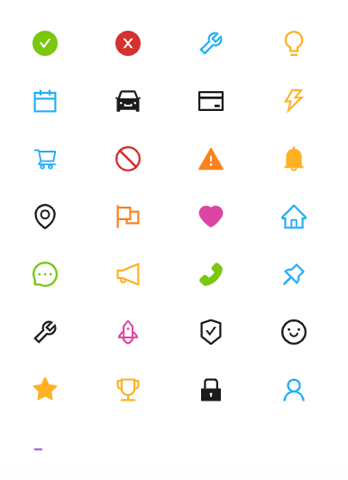
Allows you to assign icons and labels (display names) to specific values in this field. This works similarly to pillboxes, except you select an icon instead of a color. This can help users quickly scan a component to find the data they need.
Available icons
Example: The underlying data value for a “Model Number” is EXV300. You want to show a car icon when the value is EXV300 and display it as Example Model 300. You would select the car icon, enter in Example Model 300 as the display name and EXV300 as the actual value.
Links
If the value is a valid URL, selecting this option will turn this text into a link.
Autolink
This option appears for fields that are a primary key and will turn this into a link to the Super Record.
Updated about 1 year ago