
Date Time Picker
The Date Picker lets users use a date/time selector to specify a date or time. You can use a Date Picker to filter a table or combine the Date Picker with a Form or Button component.
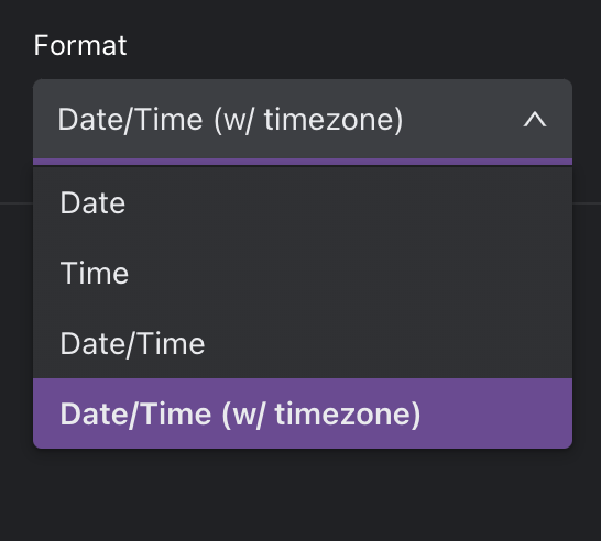
Internal currently supports the following formats for dates/times.
Defaults
You can optionally set a default value for your Date picker.

Design
Left and Top options only appear for top-level components (components that are placed directly onto the Space canvas).
Left: Set the distance of this component from the left edge of the Space canvas (x-axis position). This can be expressed as a % of the canvas or as a number of pixels.
Top: Set the distance of this component from the top edge of the Space canvas (y-axis position). This can be expressed as a % of the canvas or as a number of pixels.
Width: Set the width of this component as a number of pixels or as a % of the containing unit.
Height: Set the height of this component as a number of pixels or as a % of the containing unit.
If the component is a top-level component, the containing unit is the Space canvas.
If the component is in-line within another component, the containing unit is the parent component.
If the component is within a flexbox component, the containing unit is the flexbox.
Snap to Grid: Set the edges of this component to snap to the grid canvas in the Space.