
Form
Submit a form to perform actions with input data. The form component provides a way for users to view and manipulate multiple data fields with their inputs, and are a key part of many tools. Upon submission, forms perform functions like creating (inserting) a new data record, updating an existing record or calling APIs.
Ways to use a form
Many inputs from user
Use a form if you expect the user to interact with multiple data fields for the form's function. If you need a user to enter in an email and customer name, select an item from a dropdown, and then write a paragraph of text, forms are your best option. This is usually the best component when your function is to create entirely new data records.

Verify inputs before submission
Sometimes you may have a process where a user needs to view data fields and confirm that it's correct, or make adjustments if needed. Since form fields can display pre-filled data, you can have every field populated with data, allowing the user to view change any values that they need to.
Bind its results to another component
The results of the function performed by the form can be displayed in another component, like a table or detail view. Within the other component's configuration, select "Binding" and then choose this form component.
Want the benefits of a form but without sacrificing real estate in your design? Try a Pop-up Form.
Configuring your form
Data
Source
First, select the function that this form should perform when it is submitted.

For most databases, you'll see auto-generated insert, update, and delete functions. For example, if you selected your PostgreSQL database with a Users table, you'll see "insert Users record", "update Users record", and "delete Users record" functions appear.
For most business apps, auto-generated functions will appear, based on the available APIs of that app. For an app like Stripe, you'll see functions for "insert Balance Transactions record", "update Balance Transactions record", "delete Balance Transactions record", and so forth based on what's available in Stripe's API.
If you created any custom functions for a database or HTTP service, those will also be available for you to choose from.
Text
Here, you can edit the name of your form (used to reference this component in Internal). You can also set the the button text (and optional icon), as well any additional instructions to be displayed on your form.

Fields
Here you'll determine the actual values that are passed along when the form is submitted. To do this, you’ll select fields, and then specify what values go in them.
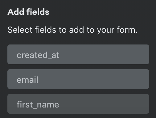
Select fields
By default, only required fields are added. For example, If you’re updating a record in a database, this would just be the primary key. Click “+” to view a list of all available fields for your selected function.
Specify values
You’ll need to choose a value that is passed in for each field. Click the field to bring up options. You can let the user type in a value, get this value from an existing component, set a custom default value, set a UUID, set to null, or set to the date-time the form is submitted (date/time fields only).
Example
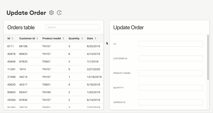
Let's walk through a commonly used setup where we get the form values from a table component. In this case, we want to build a form that will update an Orders record. To make it easier to use, we also want to pre-fill the form fields with existing data.
The best way to set this up is to first add a table with your Orders data, which will then provide data to your form.

Then, add a form component to your space, with "Update Orders record" as its function. Go to the "Fields" section and add all the form fields you want the user to see and update. Click on each field, specifying that the value comes from that same field in the Orders table. Ie, for “Quantity”, choose to get the value from a component, then select the Orders table -> Selected Row -> Data -> Quantity.

Then save and publish your space. You'll see that clicking on a row in the Orders table will prefill those values in the Update Order form (these two components are now "bound" together).
Check out Field Configuration to learn about all the options for specifying values.
Hidden Fields
Forms are great when you want users to view and potentially edit data fields. However, there are certain data fields where it is unnecessary for a user to view or alter before submitting. For these, you can use a hidden field, where data is still submitted but the field isn't shown to users of your form. Click the eye icon to make any field a hidden field.
Field Configuration is the same for hidden fields with one exception: a value must be specified, as users will not be able to enter in values (similar to a button).
Visibility Rules
You can create visibility rules that will determine when this component is visible and able to be interacted with.
- If you configure a form parameter to be hidden conditionally with visibility rules, the default value will be sent upon submit. If the default value is blank, and the “Allow this field to be blank” checkbox is not selected, the end user will not be able to submit the form.
- If a you set a value for a parameter and that parameter later becomes hidden, that value will be passed upon function submit. We do not reset the values for hidden parameters. Meaning: you could potentially send an undesirable value to your function if it is hidden after being filled in.
Effects
Display Message
This effect allows you to define the text of messages for success and failure of submission of the data from the component.
- On Successful Submit - Message to be displayed in a green-colored JavaScript alert message that will show in the UI on successful completion of the transaction between Internal and the target data source.
- On Failed Submit - Message to be displayed in a red-colored JavaScript alert message that will show when the transaction fails.
It's also important to note that not including a message will fall back to the "system message" for that component. In the case of a success, this usually produces a JavaScript alert that says "Success" and not much else. In the case of failure, this can be a custom error message added to the meta data transformer in the function editor.
Additionally, only one message is allowed to be configured per function success and one for failure.
Refresh Component
Usually, if your import changes some data that is displayed in the Space, you'll want to refresh the data. On Submit: Refresh Component options allow you to refresh the data of any component in the Space. Simply select the component to refresh from the dropdown. When the submission from your button is successfully complete, the selected component will refresh and display any changes to its data.
Auto Update by Key
This is the default state for "Effects" for this component. When the component submits its data successfully, components that are bound to that function will automatically be updated by key (e.g. Sending an email-address update to a user's table should result in the updating of associated row table data associated with that key.)
Reset Form Inputs
This is the default for "Form" types and will reset the form back to its initial state upon submission and can be ascribed to either a successful submission (the typical configuration), or a failed submission.
Design
Left and Top options only appear for top-level components (components that are placed directly onto the Space canvas).
Left: Set the distance of this component from the left edge of the Space canvas (x-axis position). This can be expressed as a % of the canvas or as a number of pixels.
Top: Set the distance of this component from the top edge of the Space canvas (y-axis position). This can be expressed as a % of the canvas or as a number of pixels.
Width: Set the width of this component as a number of pixels or as a % of the containing unit.
Height: Set the height of this component as a number of pixels or as a % of the containing unit.
If the component is a top-level component, the containing unit is the Space canvas.
If the component is in-line within another component, the containing unit is the parent component.
If the component is within a flexbox component, the containing unit is the flexbox.
Snap to Grid: Set the edges of this component to snap to the grid canvas in the Space.
Style: Set color and shape for form's button.
Form Validations
Learn more here.